


"*" indicates required fields
7 Web Design Faux-Pas to Leave Behind in 2021

When it comes to making New Year’s resolutions, we often focus on things we want to gain: new exercise routines, new hobbies, new skills. However, the new year is also a perfect time to assess the things that no longer serve us, and decide which of these things we want to leave behind in the preceding year.
Web design and digital marketing is an ever-changing field, and keeping up with best practices can be challenging. Design trends come and go, new tools are introduced constantly, and marketers are always trying to come up with ways to stand out. Meanwhile, there are certain principles of marketing that will never go away (like having a solid brand – read more about the importance of branding identities here.)
We know this is a lot to navigate for business owners who are focusing on running their business, and don’t necessarily have time to keep up with marketing trends.
Lucky for you, I’m here to tell you our top 7 web design faux-pas that you can ditch in 2022. Let’s start this year off on the right foot! First up…
1. Forgetting to design a 404 page
I’m putting this first because it’s SO easy to slip under the radar. A 404 page is what your users will see when they try to navigate to a link that no longer exists (or if they put a typo in the page URL). This important page gets overlooked because we don’t often see it when we are using other websites, and therefore don’t think of it when we build our own.
The danger here is that many users will give up and leave your site if they get an error message and can’t find what they are looking for right away. Taking the time to create a 404 page with helpful text, calls to action, and additional links is a smart tactic that many brands overlook – including us!
Until recently, our 404 page had lots of room for improvement:

The good: We explained the error and gave users the option to go back to our home page.
The bad: It was boring, and we were missing out on a huge opportunity to direct our audience to the areas of the site we want them to focus on. Overall, it needed some work. That’s why we recently dedicated some time to revamping our approach:
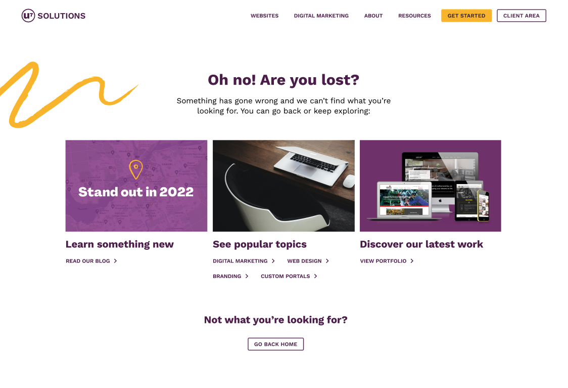
This design is so much more captivating, with large images and strong calls to action like “Discover our latest work”. We still give users the option to go back to the home page, but we also offer so much more. With this design, we are sure to keep users engaged and get them interested in exploring other parts of our website – especially the ones that may inspire them to reach out to us!
P.S… did you notice our new, streamlined logo design in the image above? More to come on that topic in future blog posts!
Boost your online presence with our help
- Web design and development
- SEO and PPC
- Social media strategy
- AI technology
2. Placing too much focus on “the fold”
This concept has been disproven for years, but the idea of keeping important content “above the fold” on a website is still very pervasive in marketing departments everywhere. In fact, there’s even an entire website dedicated to showing why the fold is a myth. As the site says, it’s not 1997 anymore. Unless they just stepped out of a time machine from the past, people understand that they need to scroll down when visiting a webpage.
“The fold” originated in the days of newspapers, when the most important articles would be placed at the top of the page. Here’s the problem: when you adopt this idea in web design, it basically translates into “fit as much content as you can into the top section of the site as you humanly can.” Goodbye white space. Hello clutter.
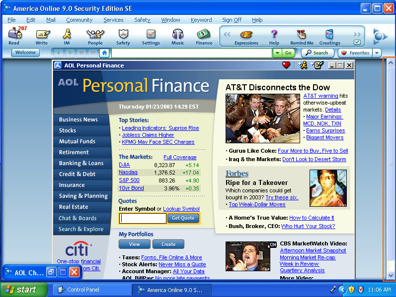
Do you miss when websites looked like this? Me neither.
In reality, studies show that many users scroll down right away when they land on a website. Therefore, more engagement happens near or just below the fold. Sure, putting call-to-actions in the hero section of your website is great, but it’s way more important to include them in the place where they’ve been convinced to take action!
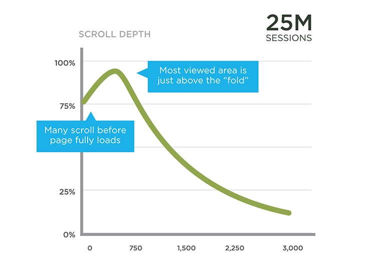
Source: There is no fold by Luke Wroblewski.
3. Including auto-rotating carousels on your home page
Speaking of “the fold” and trying to cram in as much content as possible at the top of a web page, this brings us to the next thing to ditch: hero banners with auto-rotating sales messages.
After usability testing, these banners are shown to cause more harm than good when they aren’t executed properly. Here are some of the biggest problems:
- Users are so used to seeing rotating banners that they become “banner blind” and learn to ignore them
- They tend to slow down the speed of a website significantly
- They are hard to meet accessibility standards with
- Slow moving banners will bore fast readers, and quick banners will turn away those who need more time to digest the messages
- They’re a nightmare on mobile screens (usually not optimized for small screens, super slow to load, lots of room for user error…)
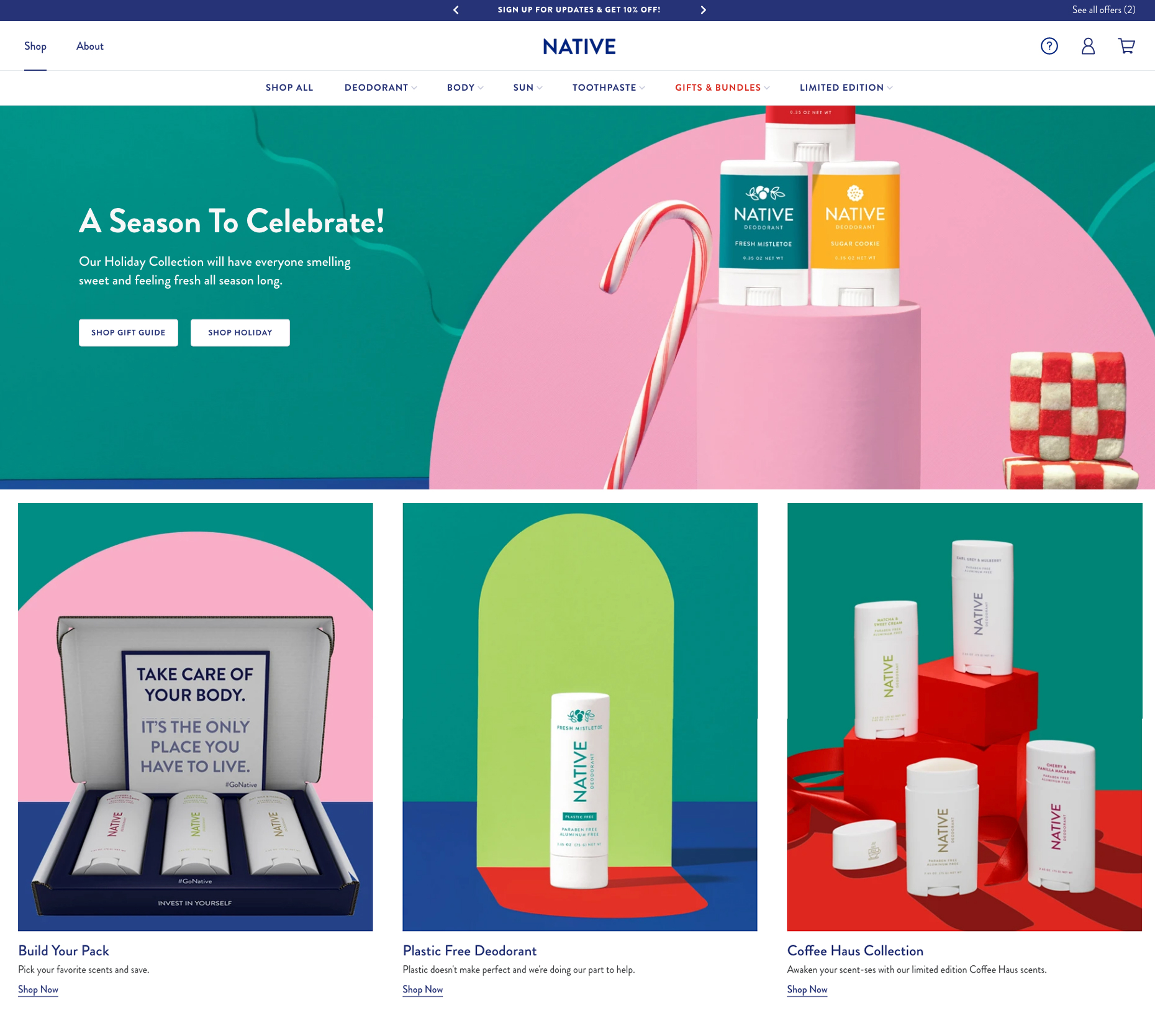
Instead, it is just as effective to create static sections on your home page that showcase your most important messages. Take Native, for example. They have successfully displayed four key messages on the first half of their home page without risking any of the usability issues mentioned above. And this design adapts to mobile screens much more easily than a carousel.
This doesn’t mean that carousels and sliders are ALWAYS a bad idea. Manual carousels are much more user-friendly than auto-rotating ones, and if you use them for the right reason, they have a lot of value.
Sliders work when you’d like to invite the user to see additional, optional content. For example, a lot of agencies, artists, and other creatives use sliders and carousels to show off their work. The difference here is that these sliders are showcasing images only, and the user won’t miss out on any key messaging if they choose to skip past it. We love this example from Elegant Seagulls, which displays their work beautifully:
4. Bombarding visitors with invasive pop-ups
I KNOW. This one might sting a little. Our clients usually think of pop-ups as a guaranteed way to get a message across to their users and make sure they see it. And I totally get that! You want to make sure clients know about sales or sign up for your email list for discounts and other promotions.
On the other side of that coin is your user. There’s nothing more jarring than when you are browsing a website, reading the content, and your screen suddenly turns black – except for a pop-up banner. Even worse: when the banner appears only seconds after you’ve landed on the website.
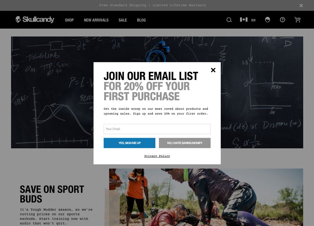
Getting interrupted doesn’t feel good for your users. Like carousels, we as a society have mostly learned to ignore these pop-ups because we know they’re trying to sell us something. These intrusive tactics make it look like you lack confidence in your website, and can even chip away at the user’s perception of your brand. Some people refer to this type of strategy as a “needy design pattern” because it looks sort of desperate.
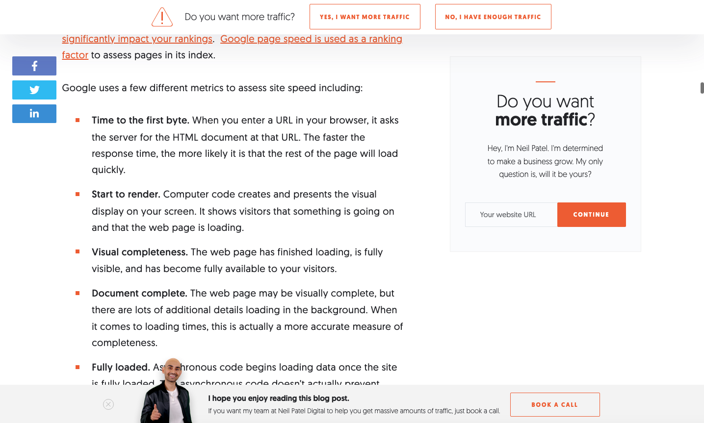
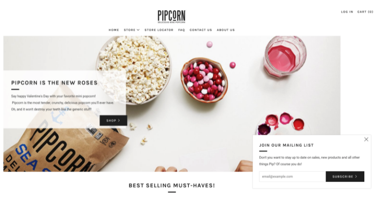
Instead, try using subtle “pop-ins” that do not cover the whole screen or disturb the actions a user might be trying to take on your website. We love the bottom “book a call” banner on Neil Patel’s website and the mailing list callout at the bottom right of the Pipcorn site:
Consider as well the large possibility that you might not need a pop-up at all. Most of the time, any message you could put into a pop-up would work just as well as a static banner or section. No matter what, when it comes to your website, user experience should always be your number one priority.
5. Overpopulating your site with icons and illustrations
If you research the pros and cons of using icons on websites or apps, you might be surprised at how heated the debate can get. You’ll even find long articles on whether solid or outline icons are more effective.
The danger of including icons or illustrations on your website “just because” is that you probably aren’t considering whether they add any value to your user. Filling up a page with icons and illustrations simply for the sake of adding visuals is not useful – it just adds clutter. To top it off, certain illustration styles have become so over-used in recent years that they immediately make your website look, well, average.
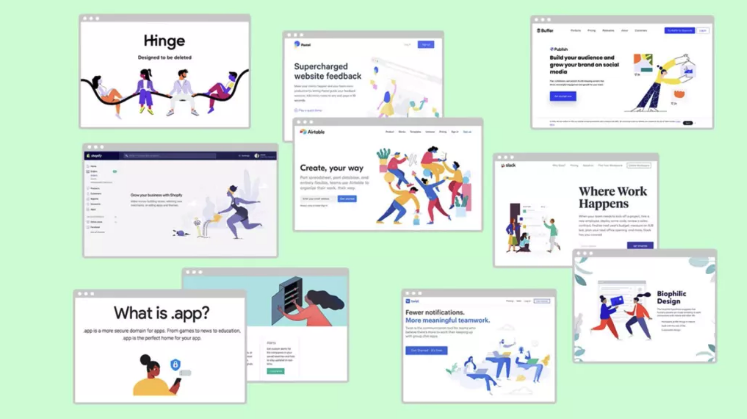
Thanks for ILLUSTRATING (get it?) my point, Creative Bloq.
Don’t get me wrong – I’m not saying to NEVER use them. Here are some things to consider when you want to incorporate icons and illustrations in a website design:
- In most cases, it is difficult for a user to understand what an icon means if it doesn’t also have a text label next to it. This excludes universal icons such as the play/pause button, trash icon, social share button, etc.
Read more on icons and how they affect website usability. - If you’re struggling to find an icon to represent an abstract concept, that might be a sign that you don’t need one at all.
- Beware of sourcing stock illustrations: do they really match the brand? Are they unique, or do they look like they could be from any website?
- Consider hiring a designer or illustrator to create unique icons and illustrations that match your brand, and will actually stand out from the crowd.
- Repetitive design patterns get overlooked by users, so it’s better to mix it up when it comes to incorporating icons – don’t add them to every page, and never on multiple sections in one page.
6. Heavily prioritizing the homepage over other pages
People usually assume that the home page is their only chance to make a good first impression, and while this is often true, it isn’t a hard rule. Really, your home page is the hook – but not likely where the sale happens.
Acquisitions brought to your site from Google have a good chance of landing on a service page before they’ve even seen your home page. Therefore, it’s important to make sure every single page of your site is on brand, well-designed, and includes strong content.
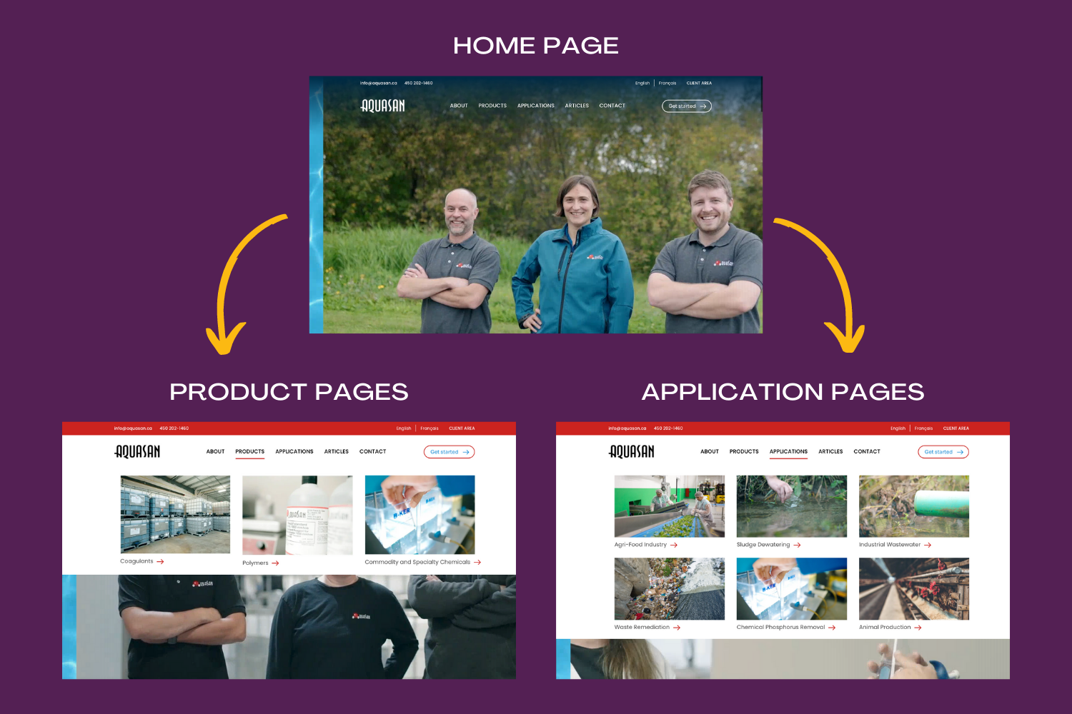
Recently, we designed and built a website for a wastewater treatment company called Aquasan. We used keyword research to determine that their users are most likely to arrive to their website when they search for relevant products (e.g. “polymer for sludge dewatering”) or applications (e.g. “industrial wastewater treatment”). We used these findings to map out 3 product and 6 application pages that meshed with what their prospective clients are searching for. Only after we nailed down the design of those pages did we work on a fun and eye-catching home page, which is designed to lead them to the product/application pages (where the sales conversion is more likely to happen).
When judging your current site or planning out a new one, consider which pages offer the most value to your customers and your sales funnel, and focus your efforts on those just as much, if not more than the home page.
7. Building websites that are not responsive
I can’t believe I have to say this in 2022, but if your website isn’t designed to function properly (and look great) on a mobile device, you are seriously hurting your business.
Since 2017, 50% of global web traffic consistently comes from mobile devices, and in 2021 we hit 54.8%. Websites that aren’t optimized for mobile provide a very poor user experience and will likely turn away potential clients. If that isn’t bad enough, Google will also penalize websites that are not responsive, resulting in MUCH lower search rankings. If you want to learn more about this, we wrote about how important it is to have a responsive website years ago!
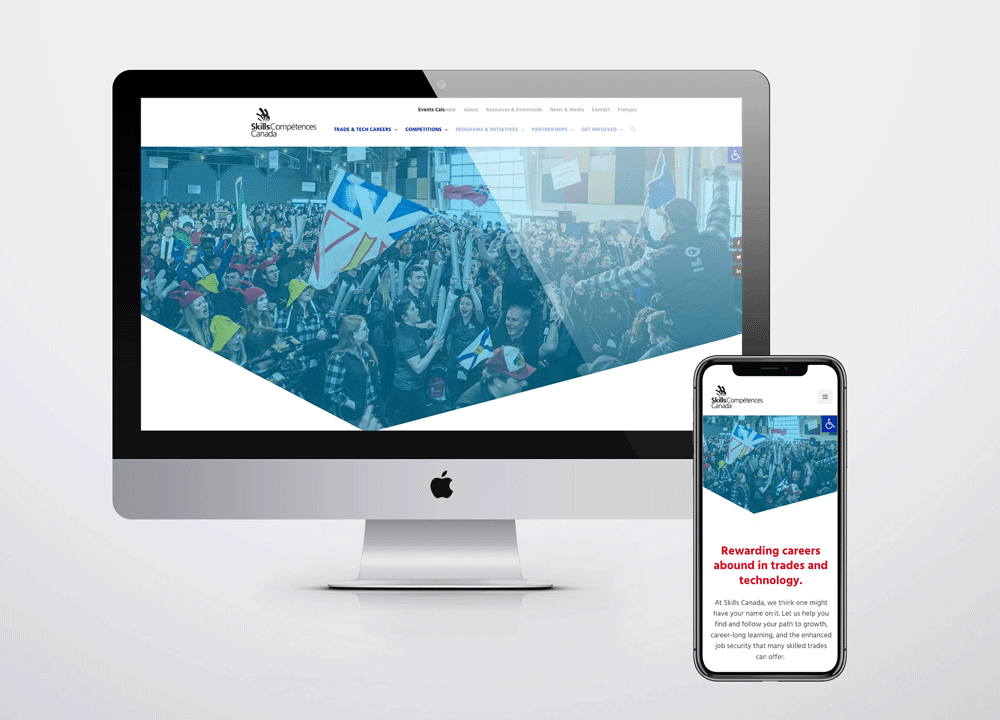
If you aren’t sure what responsive design looks like in real life, take a peek at this website that we designed for Skills Canada. As you can see below, the design looks cohesive across both screen sizes, but the layouts and interfaces have been completely tailored to fit each device and optimize the user experience.
Bonus fact: Responsive vs. Adaptive Design
If you’re a design nerd like me, you’ll enjoy learning the subtle difference between these two terms, which are often used interchangeably (though they shouldn’t be).
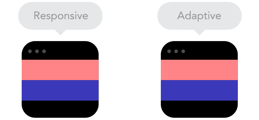
Think of a responsive website like water: it fills the entire space of the container it is poured into (the browser window). Look closely at the GIF above. You’ll see that the responsive site resizes smoothly, while the adaptive website suddenly “snaps” into a different size. While adaptive design is better than nothing, responsive design is considered best practice in 2022 and offers a far better user experience.
We all know when it comes to website design and digital marketing, you’re never really finished.
There are always more people to reach, more services to promote, and new messaging to get out into the world. That’s why it’s vital to check in with your business and your website at least once a year, and identify if you are doing anything that could be hurting your growth.
We know that most of our clients are not experts in digital marketing – and that’s why we’re here.
When you work with us, you can free up your time and focus on what you do best – running your business. Let us help with your next web design project!
Book a free consultation with us today, and we’ll work with you to identify how we can improve your digital presence in 2022.
One last question before you go: Which faux-pas will you leave behind in 2021?
Cheers!

Related posts


Book a free consult to discuss your goals
Swipe up for expert help!