


"*" indicates required fields
Design mistakes that hurt your social media presence
When I first created a Facebook account back in 2005, I never imagined that social media would become an essential tool for marketing in the near future. I posted status updates about exams, wrote inside jokes on my friends’ walls, and uploaded entire albums of photos, blissfully unaware that this platform (and all the others that came after it) would be a huge part of my future career as a graphic designer.
If you think about the work that a graphic designer does, social media might not be the first thing that comes to mind. While more and more companies are focusing their marketing efforts on their social feeds, you can see why the need for well designed posts and images has only increased year after year. After all, as of 2020, there were 3.96 billion people actively using social media around the world. If you own any kind of business, that’s a LOT of people you could be marketing to.
You can also imagine why poorly designed posts will not only be ineffective at getting your message out there, but might also be turning away potential customers – even if they can’t pinpoint exactly why they don’t like what they see.
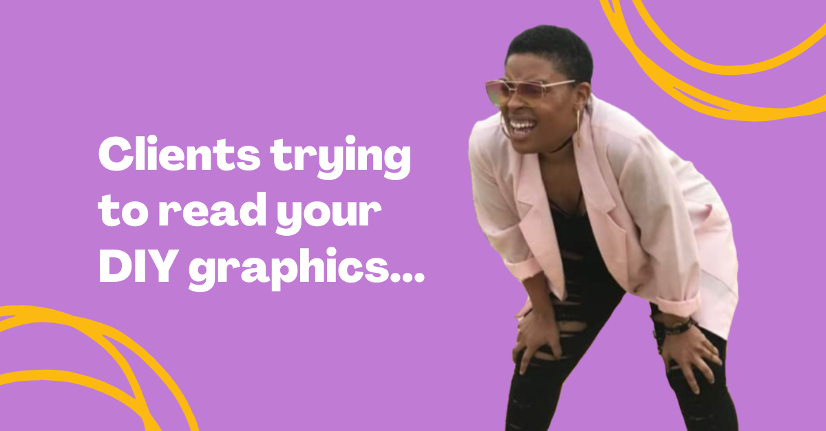
Today I’m here to tell you the top 5 design mistakes I see on social media, and why you can’t afford to keep making them.
1. The content is not tailored to the platform you’re posting it on
This is definitely the biggest mistake I see, especially from smaller businesses who are probably operating with very few staff members, or trying to DIY their designs.
While there are many free/affordable design tools out there, and making your own graphics has become extremely accessible, creating content for social media is a very unique beast. You must consider the audience who will see the post (every platform appeals to different demographics), as well as what size they will see it at (on their phone versus on their computer). This usually means creating multiple versions of every single image you’d like to share, because every platform has a different ideal post size.
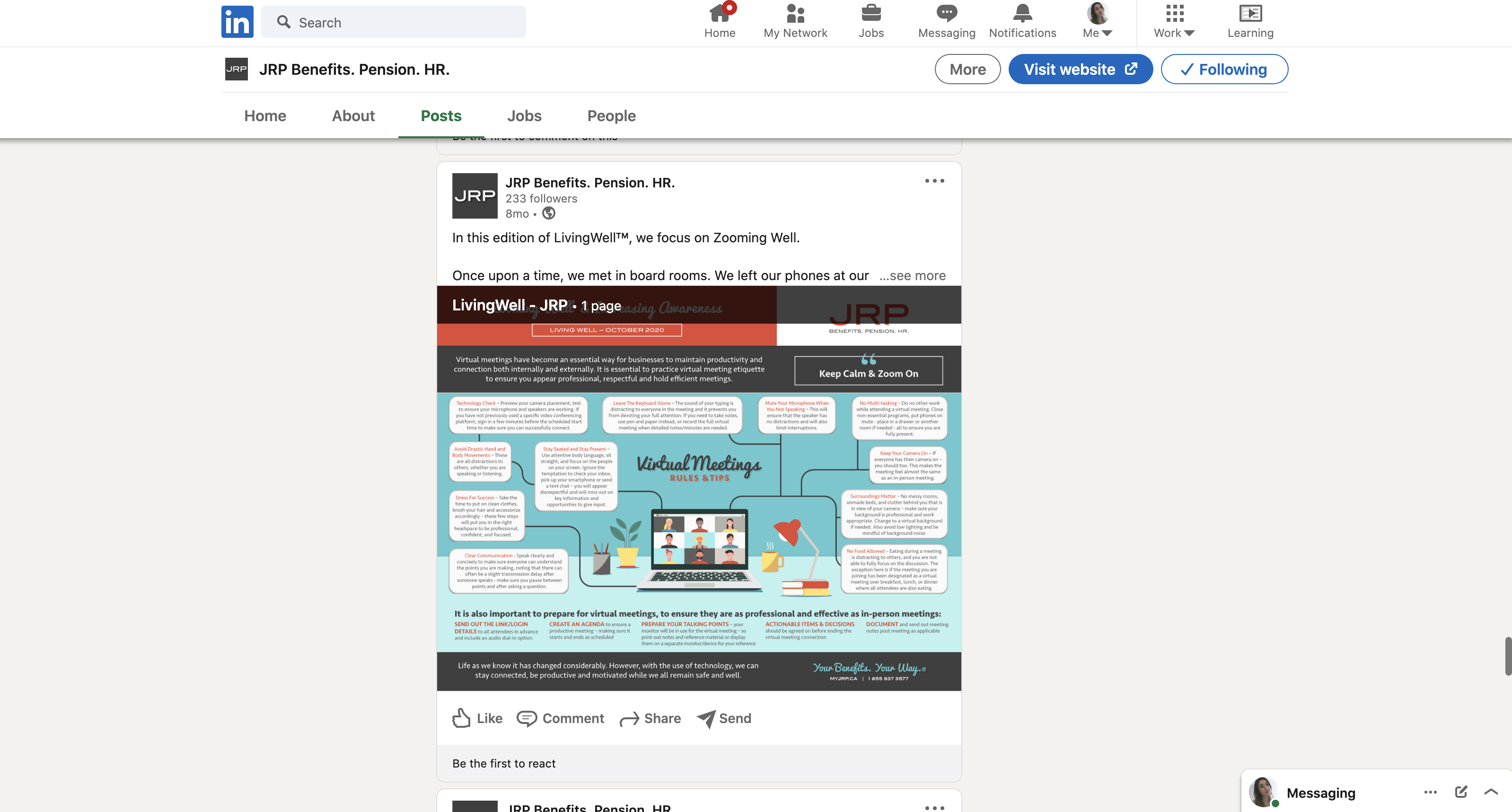
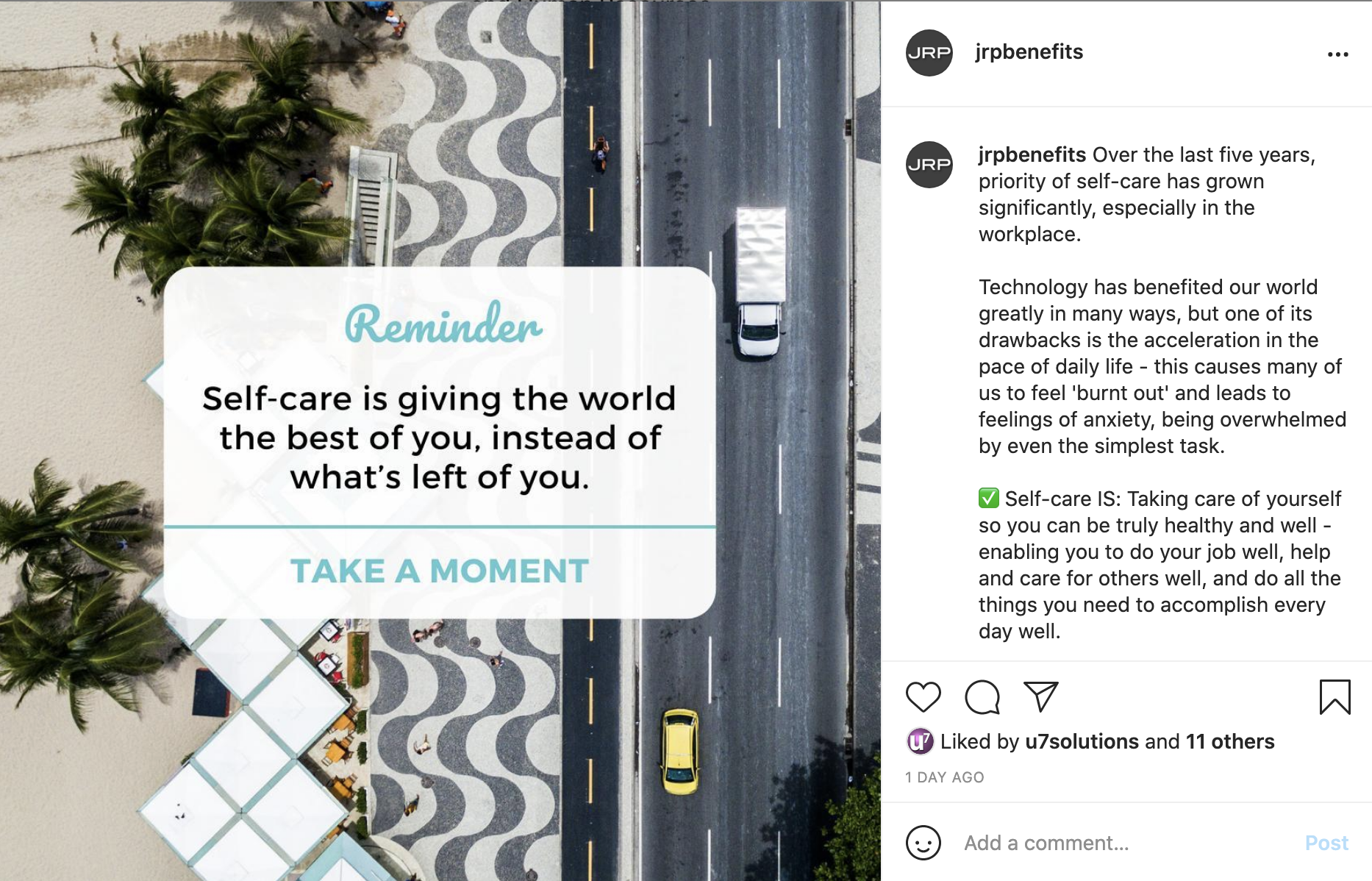
Our client at JRP Employee Benefit Solutions was able to create an awesome, on brand infographic that was perfect for a blog post, where most people access it via their computer. However, when shared on LinkedIn or Instagram, the same graphic simply has way too much text and becomes illegible when viewed on the feed or on a phone (unless you zoom in, but let’s be real, most people won’t bother). It might be a well designed document, but that doesn’t automatically mean it’ll perform well on social, where everyone is vying for your clients’ attention:
If you clutter up your social feeds with content that wasn’t designed for that specific platform, it just becomes white noise – your message isn’t getting out there.
If you’re interested in learning more about repurposing content and using social media correctly our expert Wendy has lots to say on the topic.
Boost your online presence with our help
- Web design and development
- SEO and PPC
- Social media strategy
- AI technology
2. You’ve abandoned your branding when it comes to social media
I hate to break it to you, but when a graphic is created by someone who doesn’t have any sort of design background or training, it is usually painfully obvious. One way I can always tell is from a lack of branding.
Unfortunately, this can make your business come across as cheap and unprofessional.
It’s common to see a more lax approach to brand standards when it comes to social media – we even do this ourselves when it comes to the U7 instagram account! Social media is fun, and it’s okay to have fun using it. However, it’s important to remember that it’s also an opportunity for making an impression on potential new clients, and a prime space for building up your brand.
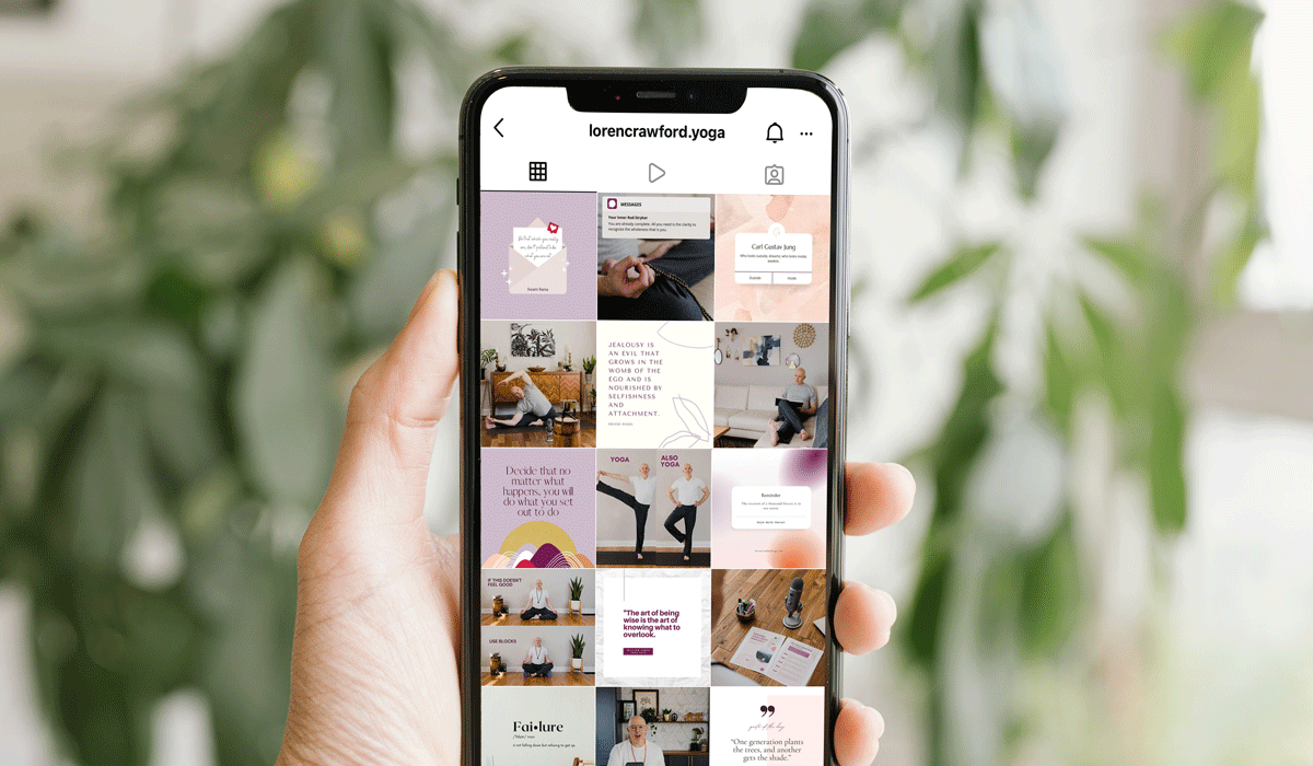
If you don’t implement at least some consistent design standards when it comes to the graphics and images you are posting, your feed will end up looking messy and amateurish. Take a look at our client Loren Crawford’s instagram feed, which we have helped to revamp over the past few months. Although the designs of the posts vary, we have kept consistent elements (like colour) throughout the whole feed in order to create a cohesive appearance.
Making sure you have the right assets to brand your social channels is also vital. For example, last month I wrote about responsive logo design. Part of this approach to branding is having a version of your logo designed specifically to fit as a social media profile picture. Having your logo appear there is usually enough – you don’t need to add it to every single graphic you make, which can look tacky (especially if it’s super small and not legible).
Other assets like custom icons, graphics, and photography can also boost your social channel’s appearance and make you stand out from the crowd.
Speaking of custom designs, this brings us to #3 on the list…
3. Your graphics look completely unoriginal.
Following trends isn’t always a good thing – especially when it comes to graphic design. If a trend doesn’t actually fit in with your brand, your target audience, or your core messaging, you’ll end up looking cheap and lazy.
This tweet might be from 2019, but I still see this trend literally everywhere. The first few brands who used it may have looked original, but now, none of them do:
this is what graphic design is now. pic.twitter.com/hmNWP5qW8n
— costco executive member (@bobby) February 26, 2019
While trends, templates, and stock imagery are useful for creating social media designs, they should only be used as a starting point.
Customizing templates to your brand’s unique personality will ensure that your posts don’t LOOK templated. And when it comes to stock photos, consider staying away from typical photos of people posing stiffly in generic office spaces.
We love our client Kristin’s take on stock imagery selected for JRP Benefits. Instead of using the aforementioned, cliché stock images, she chose to consistently use aerial photography of cities and nature, which we have continued to do as we work with them on their social strategies and designs.
Kristin explains it well:
“We don’t want our images to be super literal because they are overused in our industry – also “insurance” doesn’t really have great visuals to work with. This is why we want to use imagery that aligns with how JRP fits into the marketplace, as a metaphoric representation of our approach to benefits. Often, we try to incorporate a trail, road, or direction to signify a new path or journey for our clients to discover.”
As you can see, thinking outside the box will do wonders to make your brand stand out from the crowd.
4. Your designs have no hierarchy.
Visual hierarchy refers to the placement of text or elements in a design, to show the order of importance or guide the user experience. It is one of the key pillars of good design, if not THE most vital one. In social media design, where your space is especially limited, you can’t afford to ignore it.
We’ve all seen social posts with poor hierarchy and way too much text; they’re the ones that make you think, “holy guacamole, where am I even supposed to start looking? What is this trying to tell me?” before you scroll past it as fast as you can to avoid getting a headache.
It doesn’t always have to be that dramatic, though. A design could be simple, but if the most crucial information in a post is hidden with tiny text or a colour that doesn’t have enough contrast with the background, you can’t expect your viewer to easily find it.
Hierarchy also determines the order that your viewer is going to see the elements:
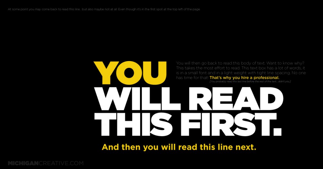
It cannot be underestimated.
5. Say it with visuals, not with words.
This is pretty cut and dry, and closely related to number 4, but – I see so many examples of social media posts with way too much text on them.
For most audiences, this is truly just not effective. You have only a couple seconds to capture a viewer’s attention. You cannot expect them to read a paragraph. Doing so will cause your posts to go unnoticed.
I love the educational content from this account, but a lot of the designs are not optimized for Instagram and have way too much text:
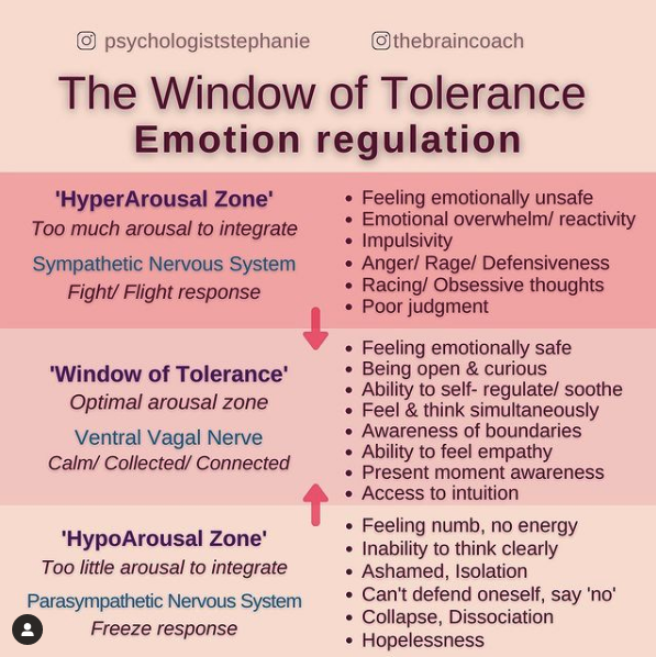
So you see how this is way too much to take in for someone scrolling on their phone? If you give your viewers some credit, use visuals whenever possible, and don’t spell out every single thing, you’ll end up with a feed that looks a lot less cluttered and much more high-end. Save long form content for blog posts or captions.
Making any of these mistakes can be detrimental to your brand and your social media marketing.
Over time, if you keep making them, your feeds will become an unnoticed and unproductive collection of images that you’ve wasted a tonne of time on.
Hiring an experienced designer or marketing team to take over your social media designs/strategy will free up your time and bring your digital presence to the next level. Plus, you can be sure they won’t make any of the errors I’ve mentioned. A graphic designer’s number one priority is to take your information and present it in a logical, beautiful, effective manner.
If you need one more push to convince you to start outsourcing this type of work, take a look at what Sara, one of our digital marketing experts, wrote about last month.
Are you ready to take the leap and let the U7 team upgrade your socials? Let’s get on a call today.
Related posts


Book a free consult to discuss your goals
[contact-form-7 id="a62b81c" title="Request a Free Consult"]
Swipe up for expert help!