"*" indicates required fields
8 Tips to Increase Website Conversions
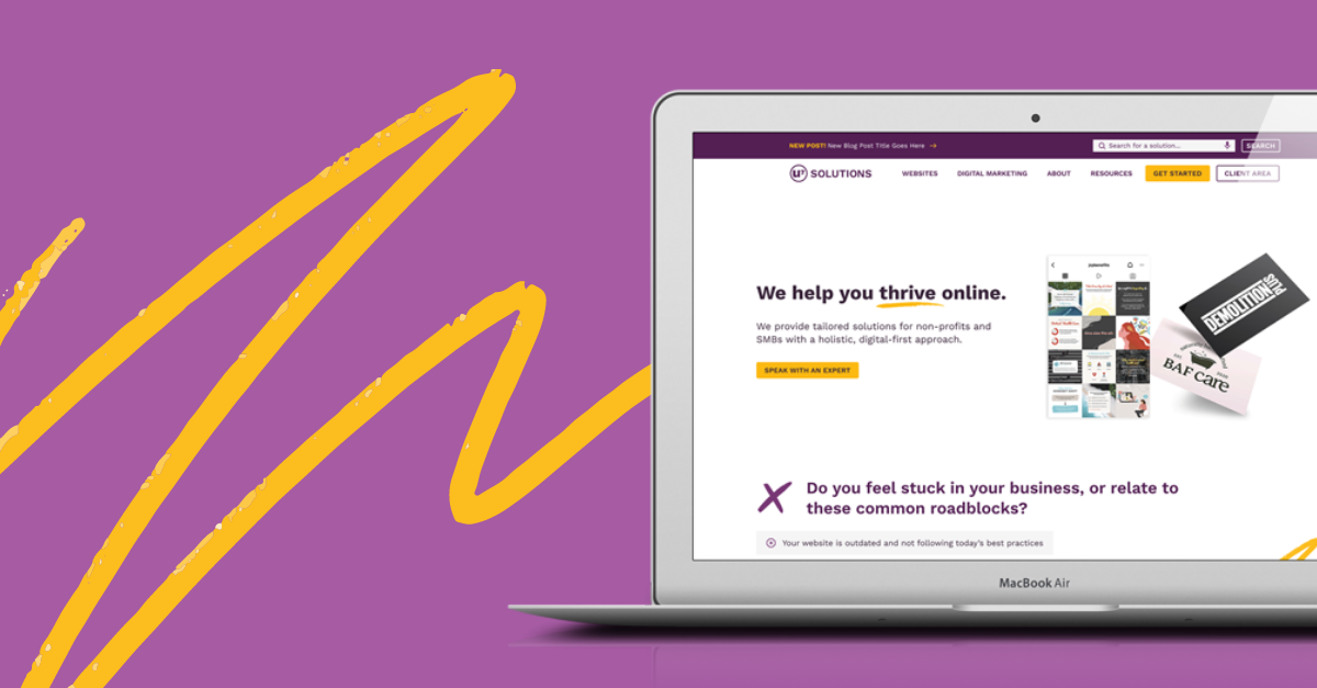
Your website was created to reflect your brand, explain what your business is about, and showcase your services/products in a way that you’re proud of. But ultimately, the goal of most websites is to have visitors engage with it. This is what we call “website conversions”.
What’s a website conversion?
A website conversion is anything you consider a desired action on your website. For a service provider, this might mean someone filling out their contact form. For websites that sell products, it could be to add products to their cart, and more importantly, checkout and pay directly on the site.
If your website’s design, content, and overall structure isn’t providing the conversion rate you hoped for – hang tight, here’s a list of tips that can help!
8 steps for more conversions
1. Highlight your value proposition
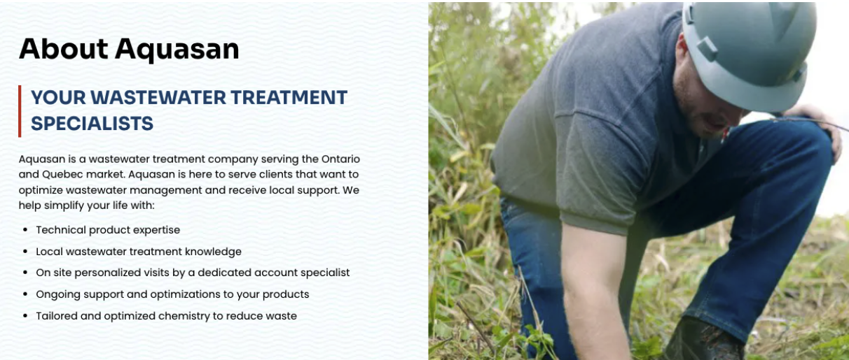
People want you to tell them why they should buy from you. On your website, you need to clearly state what makes you good at what you do, and what differentiates you from your competitors. Make sure that your site defines your Unique Selling Proposition (USP) with as few words as possible in a main headline. You can, of course, break those points down further. Here’s an example of copy we used on our client’s site that summarizes who they are and expands on what they do.
2. Use copy that your audience understands
Sometimes industry jargon is appropriately placed on your site, and other times it’s not. This depends on your target audience. Let’s say there are two businesses that sell skincare products. Business A sells products to dermatologists and skincare professionals. Business B sells to every-day consumers. Business A can use industry specific terminology that their target audience will understand and is appropriate for their educational background, whereas the ideal audience of business B will resonate with simple terms that relate to their needs.
If you’re not sure what type of language is suitable, try and ask current/old clients or ideal clients some questions surrounding the content of your site. You could even get creative on social media and share interactive polls where people vote as to whether they’re familiar with a term or not. Another idea is to send a questionnaire to your newsletter subscribers where they vote on terms they’re familiar with. Based on those results, you can consider replacing certain words you’re using.

Boost your online presence with our help
- Web design and development
- SEO and PPC
- Social media strategy
- AI technology
3. Include a button on your menu with one action to take
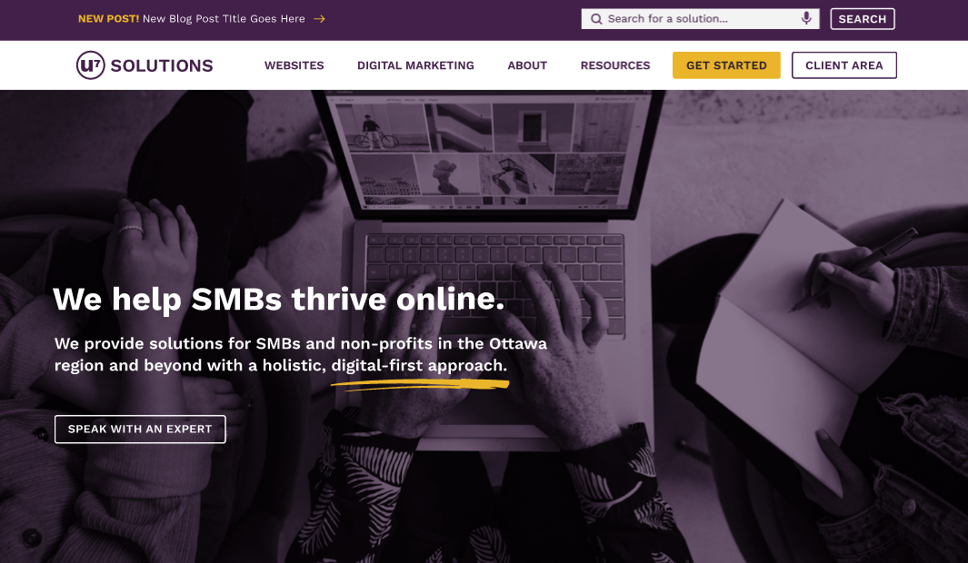
If you had to choose THE biggest goal your website is meant to achieve – what would it be? Even a hugely popular website such as Forbes magazine, which has so many articles and actions users can take, highlights their main goal with a single red button in their main menu: subscribe. This one word helps orient a user’s attention to that action and facilitate their decision-making.

4. Add a search feature on your site
Giving a user the ability to search your site not only allows them to find your content quickly, but it can also provide you with valuable insights about them. When there’s a prominent search bar on your site, users can find a direct and quick route to their ideal page and action. This makes it easier for them to get to where they want to be, especially if they’re a returning user who is already familiar with the business/organization. In addition to that benefit, you can track people’s search terms in Google Analytics (free analytics tool). That data can tell you a lot about your client base and inspire changes to your marketing efforts or business structure.
5. Increase your site speed
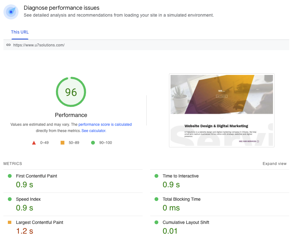
Sometimes your site is simply too slow. Users get impatient and will leave your site if it takes more than a few seconds to load. You can run a test on the free Page Speed Insights tool to verify a page’s speed on both desktop and mobile. It will tell you how long it takes to load and whether you get a green passing mark. Further down the page, it breaks down what you can do to improve site speed. Quick tip if you’re using WordPress: try the WPRocket plugin. It’s around $50 a year but so worth it. Works like magic!
6. Include appropriate calls-to-action
You want to make it easy for people to complete the ideal conversion you’re trying to achieve. If that’s booking an appointment for instance, don’t simply list your email and phone number. This is a passive approach that requires users to go through the additional steps of going to their email provider, pasting in your address, and typing their message. Many users would rather complete a form than call you directly, and not have to head off the site to send an email. This takes much less effort on their part.
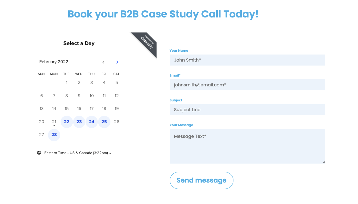
In addition to a form, you could embed a calendar booking system such as Calendly (our favourite!). You could also consider including a very customized form/booking system if you’re hoping that people will provide more information up front, like this cleaning company did on their request a quote page.
Giving both options will cater to all types of users – those looking to get started RIGHT NOW, and those looking for a more laid back contact option. Here’s a contact section we recently designed for a case study writer.
7. Create high converting landing pages
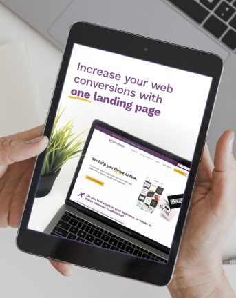
A landing page is a single page on a website that serves a clear purpose: to drive conversions. Unlike other pages on your site like the homepage, a landing page should focus on ONE action, rather than many. Instead of having buttons that direct people to the about page, an article, a pricing page, or your blog, all the buttons or calls-to-action on the page will focus on the same goal. Landing pages like this are often a key part of a successful online advertising campaign, whereby specific ads get created around different landing page topics.
Ready to set yourself up with a high converting landing page?
Get instant access to THE recipe for a successful landing page. You'll get:
- The 7 essential components of any B2B landing page
- 4 bonus ideas to elevate your page even further
- A checklist to reference for future projects
- A design template to get you started
8. Track results, analytics and monitor performance
Optimize your page layouts to get the best results possible, and understand how users are interacting with your website. Tools like eye tracking, scroll maps, mouse tracking, and click maps provide insights on how people interact with your pages and which sections they engage with the most. Consider using a tool like Crazy Egg that offers several ways of understanding how your audience is using your website. Set up goals to track your conversions via organic, social, ads to better understand how well your pages are doing.
Help! I need higher conversions NOW.
If you feel stuck, busy, or unmotivated to use these tips – we’re here for you. Our team of skilled copywriting, SEO, design, and development experts will ensure your site is modern, on brand, and using best practices for higher conversions.
If you’re curious about how we have applied these concepts to our own business, head to our get started page to take a peek and learn more about our process to help you convert!
Book a free consult to discuss your goals
Swipe up for expert help!
