


"*" indicates required fields
Why you can’t risk not having a mobile-responsive site in 2018

If you’re wondering what mobile-responsive means, why you should care, and what the impacts are, you’re in the right place. Read on my friend.
Why you should care: mobile users are rising, says Google
Generation Z may not believe that there was a time when the Internet could only be accessed by a desktop computer fixed in one place. Oh how far we’ve come. Seems like just yesterday we were connecting to our Dial-Up Internet access.
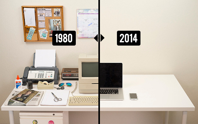
All of us who grew up with floppy disks, cassette-tapes, and old clunky computers, are constantly blown-away with technological progression. It’s pretty fascinating the Internet is accessible on tiny devices as small as a watch, and most of us can attest to using the Internet on our phones everyday. With this movement, you may claim to have been one of the wise oracles that predicted “one day mobile web users will exceed desktop users”.
Well, you can call all your friends and start your fortune-telling business because…
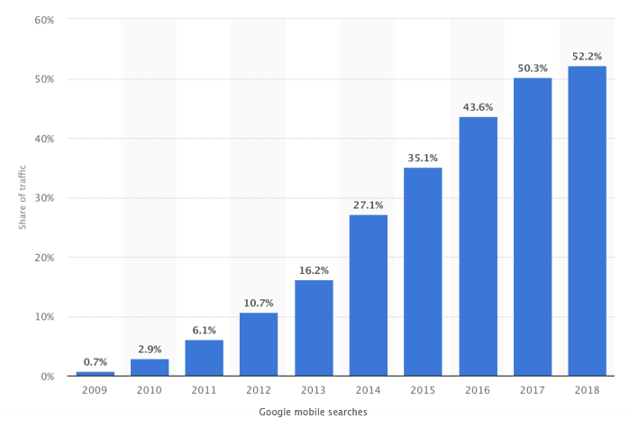
According to this report by Statista, mobile web searches have SURPASSED desktop searches this year and 52.5% of google’s traffic is officially coming from MOBILE searches.
This is absolutely revolutionary for website owners and the importance of mobile-responsiveness. Now, what is ‘mobile responsive’ exactly?

Boost your online presence with our help
- Web design and development
- SEO and PPC
- Social media strategy
- AI technology
Capture the best of the internet with a mobile responsive website
When it comes to clothes, a ‘One Size Fits All’ never really fits all perfectly does it? Everyone’s body is unique and requires a certain fit adjusted to their specific silhouettes. Same goes for screens.
We once had one screen size or maybe a few different sizes at tops, but they were relatively similar. This made it simple to create a website that would be adjusted to these sizes. Nowadays, web designers and developers need to consider multiple screen sizes and create according to their specific dimensions.
When a website is being developed, all the proportions are being taken into consideration to place the proper sized images, text, videos, and other content. A nice website on a desktop, just won’t function properly on a mobile phone. Kind of life your one-size-does-not-fit-all shorts.
Now let’s dive into the two main benefits of having a mobile-responsive website to explain this a little further.
Here are TWO main ways a website will benefit from being mobile-responsive:
1. BETTER USER EXPERIENCE
Have you ever surfed the web on your phone and felt that your fat fingers couldn’t click on those links and buttons? You’re desperately zooming in on every page to navigate the website and see the images properly. That’s because the website you are on is NOT mobile-responsive. The website was not designed for your mobile screen and is showing you the desktop or another version of the site.
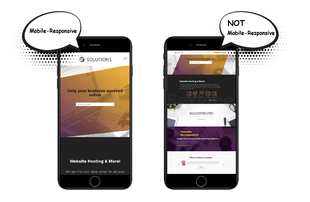
When the website is not mobile-responsive it results in a frustrating user experience and low conversion rates. Nobody wants to feel like they have fat fingers and take 9 tries to click through to a link.
Your website should adjust to screen sizes and fast-loading content optimized for smaller screens. The goal is to create a natural user experience for everyone regardless of the size of the screen or device they are on.
2. BETTER RANKING ON GOOGLE
In April 2015, one of the biggest Google Algorithm updates was released, in what is known as Mobilegeddon. Essentially, Google started rewarding mobile-responsive sites in their search rankings and penalizing sites that were not mobile-friendly.
But this year, in March 2018, Google rolled out a new algorithm that will get websites scrambling even more, it’s called mobile-first indexing. Google says: “Mobile-first indexing means that we’ll use the mobile version of the page for indexing and ranking, to better help our – primarily mobile – users find what they’re looking for.”
Therefore if your website is not mobile-responsive, Google will drop your SEO rankings, which results in fewer people seeing and clicking on your site. It does not mean that your desktop website will not show in Google’s ranking, it is called “mobile-first” and not “mobile-only”. However, your desktop site may receive a lower ranking alongside other mobile-responsive sites.
What should I do now? Take the test!
If you’re reading this article you probably have a website or manage a website, or maybe you’re just a keener. The next step would be to verify if the website you’re curious about is mobile-responsive.
This is made very easy thanks to Google’s Mobile Friendly Test: simply go to the page and insert the website URL.

How do you get a mobile-responsive website?
Ensuring your website is mobile responsive can be complex.
There are many courses available such as this one, that can help you understand how to implement changes yourself. If you don’t have the time available or patience, you can request assistance from a web developer or development company like U7 Solutions.
We adopt and embrace a “mobile-first” mentality when we design and build sites. If you already have a website and it’s not mobile-responsive, we can create the mobile experience based on your current material, or provide a redesign.
If you’re looking for assistance in making a website mobile-responsive, lets schedule a call or meeting to go over what technology your website is using and what it takes to become mobile-responsive.
Related posts


Book a free consult to discuss your goals
Swipe up for expert help!